Kirby and the Lovely Colors

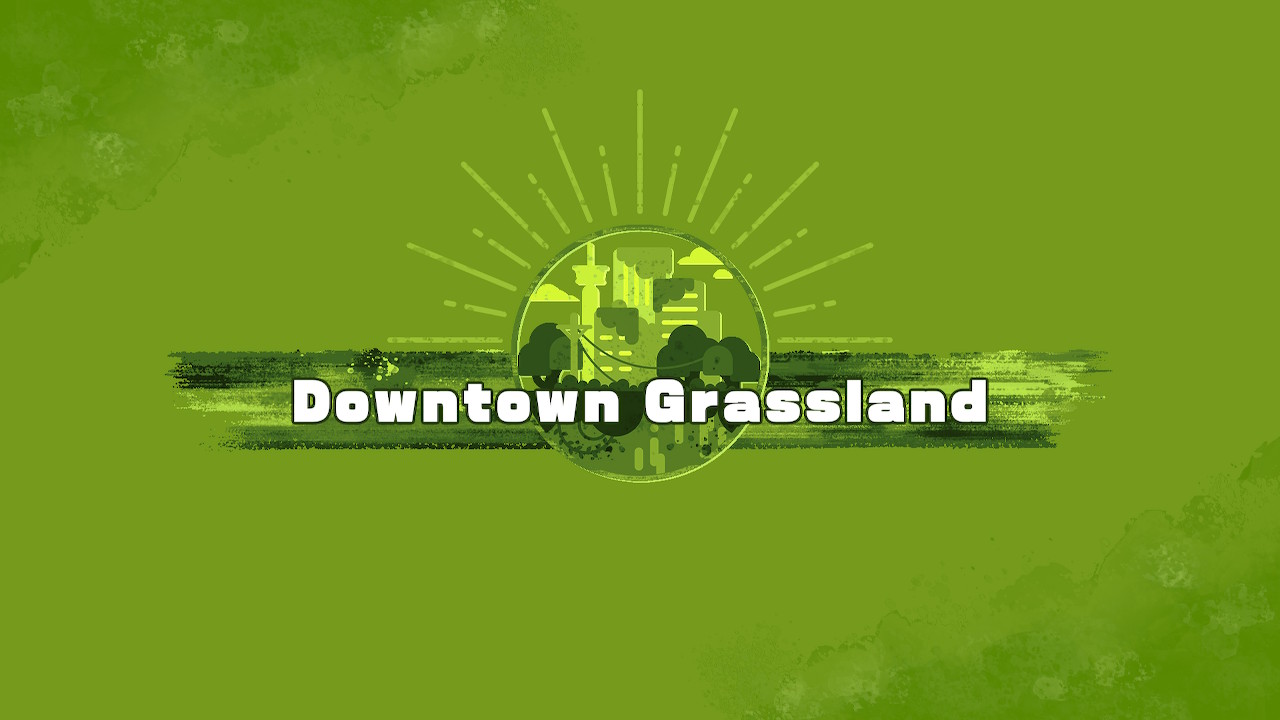
Kirby and the Forgotten Land released last friday, and it's a lot of fun so far. I love the flat color, monochromatic graphics that display during the level loading screens. I've spoken before about how I like flat colors. The definition of a "flat color" appears to be a color with no shading, texture, gradation, or halftones at all. The kind of colors I like fit the definition of flat color, but I'm okay with a bit of texture or large stylized halftones; these are the kinds of color the last two kirby games have used.
The colors in forgotton land's loading screens don't use any shading or gradients, but they do use paint-like texture. The circular graphics appear to have been drawn with only flat colors first, and then a splotchy paint drop texture was overlayed on top of them. There's also a multishaded brush stroke behind the circle.
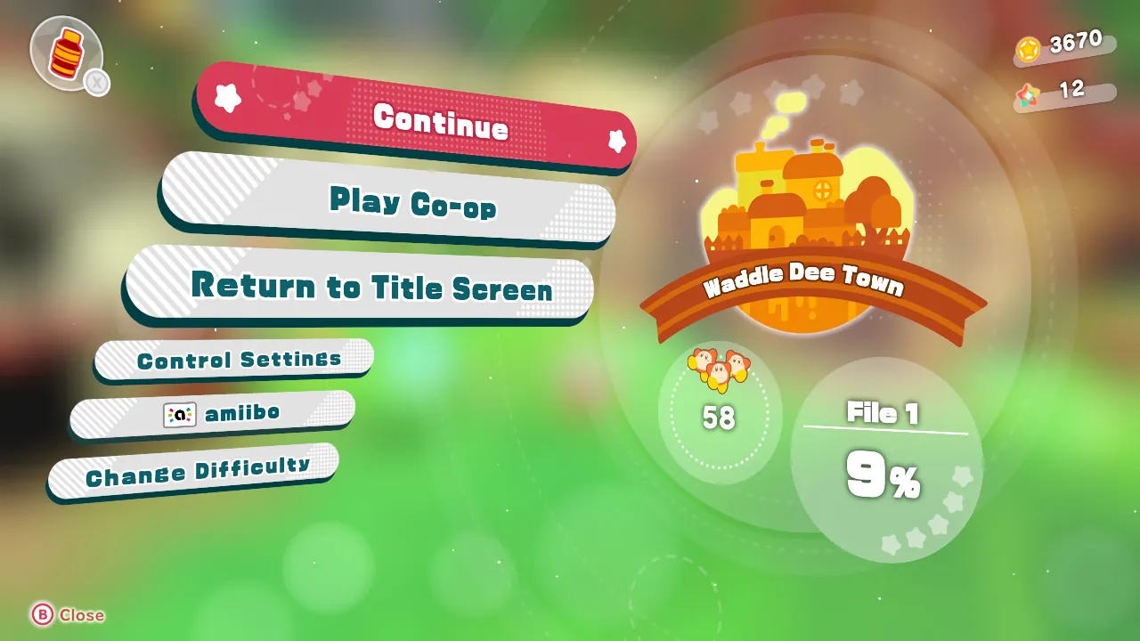
I love flat colors, but they are used a lot in today's brands, and they might be getting a bit boring to many people, so I think adding a bit of texture like this was a wonderful touch that brings out the natural beauty of and enhances the artwork. These paint splotches aren't used everywhere in the game, though. The graphics for Waddle Dee Town don't use the splotchy texture at all. The sparse use of the paint texture suggests that it has a symbolic meaning: it represents the wild nature of the Beast Pack, the game's antagonists, and the main residents of the game's setting.

So, most of the game just uses standard flat colors. Maybe that's for the best, it makes the splotches more special when they are used. If paint-like textures were used in every part of the User Interface, it might look more like Pokémon Legends: Arceus, which uses black, dark blue, and brush stroke textures to invoke the idea of Japanese calligraphy. Kirby and the Forgotten Land doesn't take place in traditional Japan. Using too many paint-like textures may also give the impression that the game is all about painting, which also isn't true.
When thinking about how Kirby and the Forgotten Land uses only flat colors for its UI, I realized that none of the 3D models use flat colors; they're all shaded. This makes Kirby look quite different from something like Donut County, which only uses flat colors period. It also helps to distinguish the UI from the characters and landscape.

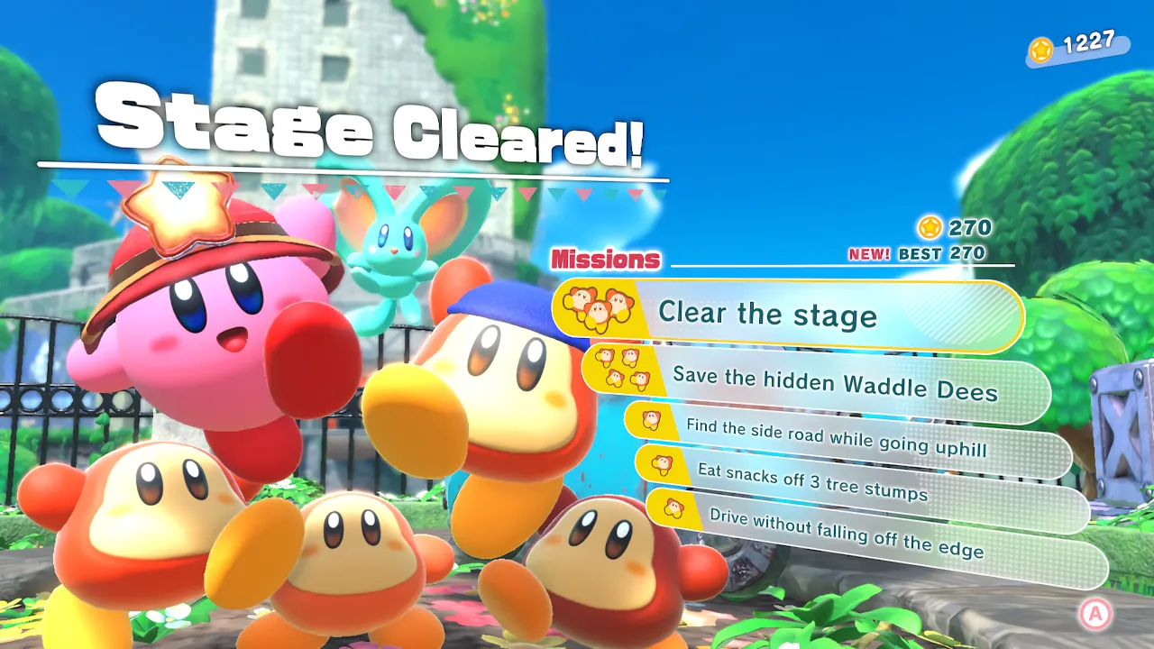
One last thing I have to say about Forgotten Land; I love how the characters are made a part of the User Interface. The end of level screens have a freeze frame of Kirby and the Waddle Dees jumping for joy. The level select screen has kirby fly up next to the text. My favorite are the little animations of Kirby doing things in Waddle Dee Town; like turning the handle on the gacha machine or signing for a package; it's very cute.

Although Forgotten Land isn't the first Kirby game to use flat colors this much, it's still a recent development; and it started with Kirby Star Allies in 2018. This game uses a lot of large halftone patterns, giving it an appearance comparable to a comic book. It sparsely uses gradients, letting the expertly picked color palettes speak on their own. It's a style that blew me away when I first saw it, and I'm so glad to see flat colors used again for Forgotten Land.
