Donut County and Other Games I Played Recently

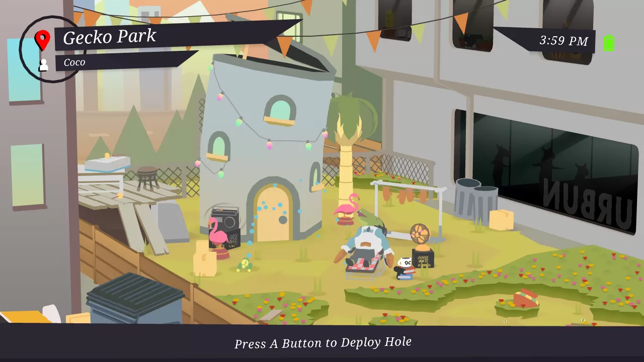
Out of the new games I've played recently (which isn't that many), Donut County probably has my favorite art direction. While playing it, I realized that it has many of the design points that I mentioned liking in "Talking About My Inspirations". It uses simple shapes with flat pastel colors. The pastel very nicely communicates its status as a relaxing game. The UI uses a color that appears to be black, but is actually a dark, desaturated blue, making it just a bit more interesting and fitting better with the pastel. It also uses more saturated accent colors. The shapes of the UI elements are very angular; rectangles that end in equilateral or right triangles. Sometimes they have a more octagonal shape. Also, they're often displayed at a slight angle instead of being straight horizontal. Perhaps all of these decisions make the UI a bit more dynamic-looking.
It also has this cool effect where the screen will turn into mixed red and green paints when you pause, and there's palm tree leaves and chill music. Little details like that give the game life.

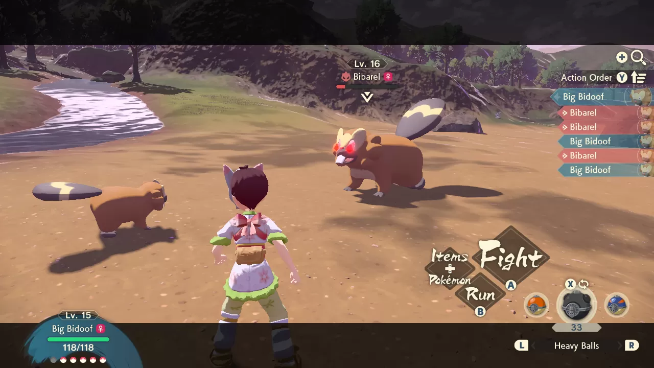
The other games I played recently are Pokémon Legends: Arceus and Untitled Goose Game. Pokémon's UI didn't stand out to me as much, but it's well designed and suits the game. The game's world itself has nice pastel colors, but the UI uses mostly dark or other monochromatic colors. Perhaps this is intentional, to easily distinguish between the world and the user interface. It also establishes the game as being more serious. Many UI elements are designed after brush strokes, to fit the game's Meiji period setting.

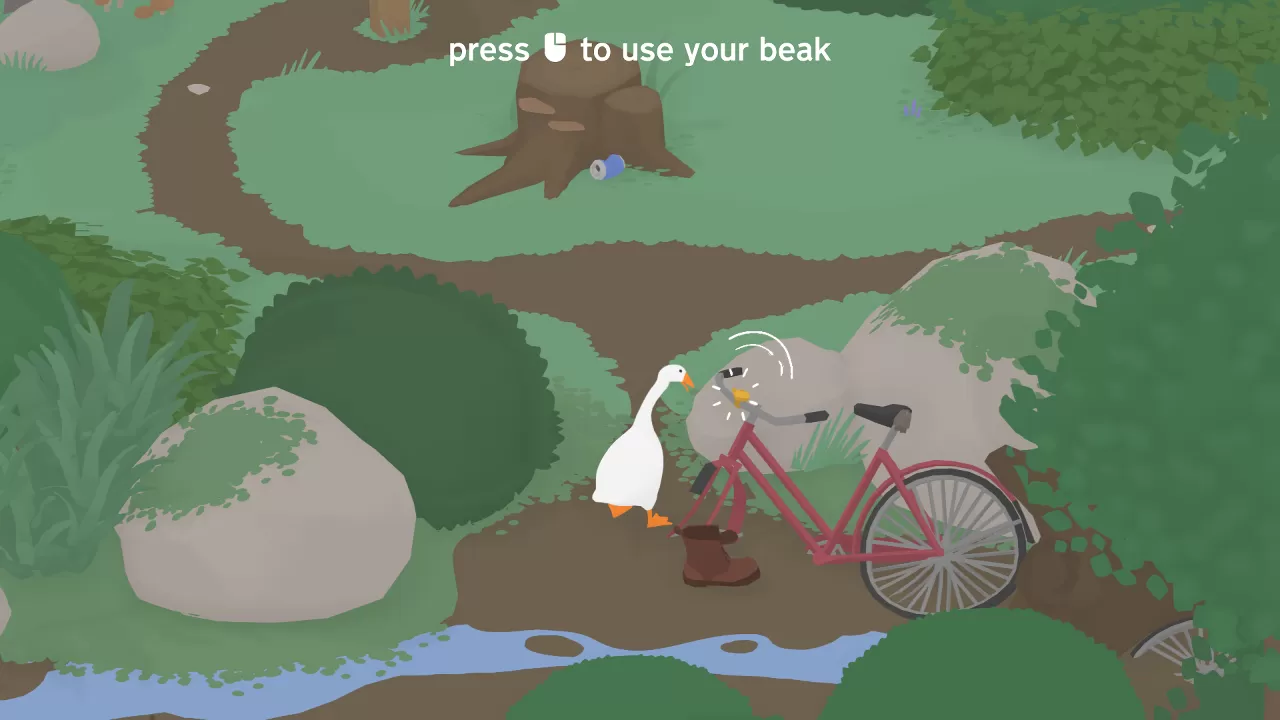
Untitled Goose Game has a look that's very similar to Donut County, the main difference is that Goose Game doesn't use as much pastels. Pastels are highly saturated colors with a high luminosity. The higher the luminosity, the closer the color is to white. Saturation determines whether a color looks like the color, or if it looks more grey. Goose Game uses a very muted color scheme, most of the color are neither at full saturation nor full brightness. The exception to this is the goose itself (or geese, when playing multiplayer). the goose's feathers are 100% white, and its beak is a fully saturated orange. The goose stands out against the muted color shceme of its environment.
I also noticed that it uses the font Compagnon Italic for the options menu text, the same font that I currently use for the headers on my website! I chose this font because it has lots of cute ball terminals. I looked through many fonts to find one that resembled my handwritten logo, and Compagnon Italic was the closest match I found. I may replace it with my own hand-made font someday, so it's nice to see Compagnon being used somewhere else.
Though the differences between Donut County's pastel color scheme and Untitled Goose Game's muted color scheme are very subtle, they make a big difference to the tone of the game, and give each game its unique visual identity. They may have been selected to best suit each games' playable character. The bright white goose needs a world of muted greys, browns and greens, while the dark hole that you pilot around in Donut County needs a subtly bright environment to live in.
