

Talking About Video Games Now Because I was too Scared to Earlier
Hello! There were a few times when I was writing my previous posts that I wanted to talk about video games, but I was worried that doing so would come across as unprofessional. Well, considering that the course I'm in teaches game design, I figured it's time to stop being so scared.
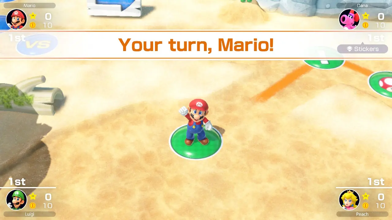
In my first post; I mentioned that a design can be solid on its own, but ineffective for the thing it's used for. I was thinking of Mario Party Superstars when I wrote that. The game's User Interface is very clean and readable. It uses the color white most of the time, and it only uses one font. However, I could have sworn I saw comments on the internet saying the game felt "bland", "soulless", and "corporate". I can't seem to find those comments now, unfortunately, but it made me think; while this design would be excellent for a readable website, it's not exactly fitting for Mario Party.
Thinking about Mario Party and questionable UI decisions also reminded me of this video! In it, Mario Party 8's overuse of different fonts and font styles, as well as its inconsistent buttons and cluttered look all around, are listed as one of the chief examples of Bad Design. One interesting thing about the comments on this video is; I noticed a reaction that was opposite to the way I (remembered) people reacting to Superstars' UI;I'm sure most people playing Mario Party never even give thought to the UI design
,I never really cared about typographic design choices and really like MP8 but now that you mention it... wow, it really is all over the place. Now I can't unsee it D:
,I would say the design for that Mario Party has a ridiculous amount of early 2000's websites charm but that's just my aesthetic.
,I personally quite liked Mario Party 8's look. The chaotic look just screams 'Welcome to Mario Party!'
.
Of course, there were also comments agreeing that the UI is a mess, and I don't disagree either that it doesn't look very good, but I find the idea that "people will react better to a "bad" ui than a "good" one because the "good" ui is too bland" to be interesting.
In my second post; I talked about how I like limited colors. Sprites like these are why. Because 8-bit sprite designers only had three colors to work with, (fun fact: it's technically four, but the transparency layer takes up a colors slot) They had to get the most use out of each color. Many sprites would have one dark color, one light color, and one color that's in the middle. This is the kind of color scheme that I aim for with my website, it makes everything simple and readable. I also find it very admirable that designers were able to create many good designs with such contraints.