My Thoughts on Illustrator's Image Trace
When I saw the Image Trace feature, I thought it would be an easy way to take low resolution art and convert it into high quality, perfect SVG. Yes, it had the limitation of only tracing images in black and white, but I could simply adjust the colors to work around that, couldn't I? But I realized that converting a bitmap to an SVG still takes a lot of work. Even though Image Trace does do a huge chunk for you, it also draws the many odd bumps that are in your original image. In a bitmap, little imperfections like that would be unnoticeable. They just blend in with the pixels, then our mind blends the pixels together to create a perfect, high-quality image that's not actually there. It's one of the best things about pixel art. But when drawing in SVG, every little mistake stands out that much more.
My dad said that 30 years ago, he had tried to do something similar in Illustrator, on an old Mac computer, to create a scalable version of a logo that could be printed at many different sizes. He ran into the same problem that I did, and spent a lot of time fixing it. I guess no matter how much time passes, a machine simply can't see things the same way a human can.

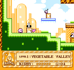
Many people who play retro games will use pixel art upscalers to make the games look "smoother". At times, it produces quite pretty results, but for the reasons stated above, I could never feel comfortable using one of these filters. I feel like such filters are guaranteed to make mistakes, so I would rather look at the pixel art and leave the figure being depicted up to my imagination. This is also why I quite like composite and CRT filters, they blur the pixels even further, leaving things more up to the imagination. Some may say this makes it impossible to see detail, but I think that in a way, it makes the game even more beautiful, because when we can't see detail, we imagine the most beautiful possible version of the image.

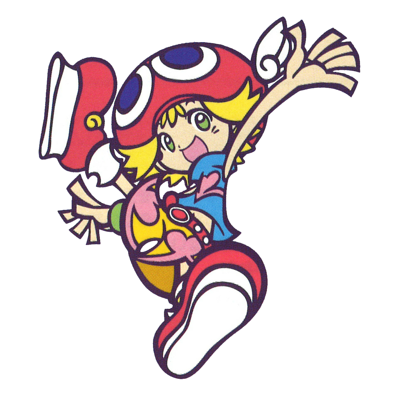
Puyo Pop Fever is a puzzle game first released on arcade in 2003. The game's lead character designer was Hideyuki Takenami. The designs use bold, expressive linework and poses, as well as flat colors with no shading. This art is a big inspiration for me, even though linework isn't my strongsuit. Likely because the game was released so long ago, there aren't many high resolution images available of the game's characters. I thought I could use the Image Trace tool to easily trace the outlines, then fill in the empty spaces with color, to create SVGs of all the games characters. While my attempt did turn out quite well, thanks to the artstyle being suited for SVG, if you look closely, you can see some odd bumps and flats that shouldn't be there. Sometimes I wonder why companies don't use SVG on their websites for character art like this, it makes me wonder if Takenami didn't actually use vector for this artwork originally.
